 |

|
| ActiveWin: Reviews | Active Network | New Reviews | Old Reviews | Interviews |Mailing List | Forums |
|
|
|
|
|
DirectX |
|
ActiveMac |
|
Downloads |
|
Forums |
|
Interviews |
|
News |
|
MS Games & Hardware |
|
Reviews |
|
Support Center |
|
Windows 2000 |
|
Windows Me |
|
Windows Server 2003 |
|
Windows Vista |
|
Windows XP |
|
|
|
|
|
|
|
News Centers |
|
Windows/Microsoft |
|
DVD |
|
Apple/Mac |
|
Xbox |
|
News Search |
|
|
|
|
|
|
|
ActiveXBox |
|
Xbox News |
|
Box Shots |
|
Inside The Xbox |
|
Released Titles |
|
Announced Titles |
|
Screenshots/Videos |
|
History Of The Xbox |
|
Links |
|
Forum |
|
FAQ |
|
|
|
|
|
|
|
Windows XP |
|
Introduction |
|
System Requirements |
|
Home Features |
|
Pro Features |
|
Upgrade Checklists |
|
History |
|
FAQ |
|
Links |
|
TopTechTips |
|
|
|
|
|
|
|
FAQ's |
|
Windows Vista |
|
Windows 98/98 SE |
|
Windows 2000 |
|
Windows Me |
|
Windows Server 2002 |
|
Windows "Whistler" XP |
|
Windows CE |
|
Internet Explorer 6 |
|
Internet Explorer 5 |
|
Xbox |
|
Xbox 360 |
|
DirectX |
|
DVD's |
|
|
|
|
|
|
|
TopTechTips |
|
Registry Tips |
|
Windows 95/98 |
|
Windows 2000 |
|
Internet Explorer 5 |
|
Program Tips |
|
Easter Eggs |
|
Hardware |
|
DVD |
|
|
|
|
|
|
|
ActiveDVD |
|
DVD News |
|
DVD Forum |
|
Glossary |
|
Tips |
|
Articles |
|
Reviews |
|
News Archive |
|
Links |
|
Drivers |
|
|
|
|
|
|
|
Latest Reviews |
|
Xbox/Games |
|
Fallout 3 |
|
|
|
Applications |
|
Windows Server 2008 R2 |
|
Windows 7 |
|
|
|
Hardware |
|
iPod Touch 32GB |
|
|
|
|
|
|
|
Latest Interviews |
|
Steve Ballmer |
|
Jim Allchin |
|
|
|
|
|
|
|
Site News/Info |
|
About This Site |
|
Affiliates |
|
Contact Us |
|
Default Home Page |
|
Link To Us |
|
Links |
|
News Archive |
|
Site Search |
|
Awards |
|
|
|
|
|
|
|
Credits |


|
Product: Windows XP Professional |
A New Graphic Style
|
Table Of Contents |
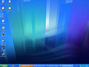
The first thing you�ll obviously notice with Windows XP is the brand new visual style of the interface once upon a time dubbed �Luna�. Windows 9x interface has been totally revamped and now features a visually appealing fresh new look. Some people complain this new bluish interface has been designed for idiots since it looks like a Playschool toy, but it�s very pleasant to use. The bottom taskbar is now blue with a new stylish 3D look and the start button is green.
Natively the Windows XP desktop comes empty with absolutely no icons on it (apart the recycle bin) and the quick launch bar near the start menu is disabled. This choice- made by Microsoft to not clutter the user�s desktop - is confusing. Windows users will be clearly disrupted to not find icons to launch �My Computer� or Microsoft Internet Explorer. Obviously you can change those settings so the Internet Explorer, My Computer & My Documents icons can be seen on the desktop. A right click on the taskbar will let you unlock it (so you can move it around the desktop) and display the quick launch bar� for easy access to your favorite programs from a simple click near the start menu without the need to minimize actual windows.
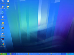
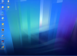
New Windows XP
Desktop (click to enlarge)
Many users were previously bogged down by the dozens of icons installed by third party applications appearing in the tray notification area causing the task area to be so small only one or two program buttons could appear. Based on customers� feedback, Microsoft has implemented a well thought feature that automatically hides unused tray icons. When these icons are hidden a small rounded arrow button appears letting you display the previously hidden tray icons (obviously another click will re-hide those tray icons). Novice users may be surprised to see their tray icons disappearing all of a sudden, so that�s why Microsoft added a help bullet stating why the icons were hidden and how to restore them. Advanced users can define which tray icons you want to hide through the taskbar & start menu settings applet.
![]()
![]()
Windows XP
Tray Notification Area with
auto hide mechanism (click to enlarge)
The shell carries another major enhancement: when several windows of the same program are opened (like three Word documents) they�re all being grouped automatically into one single taskbar button. A click on this taskbar button will display a drop down list from which you can easily switch between the various opened windows. This feature is especially useful when surfing the web since the desktop is generally cluttered with several Internet Explorer windows. Now your taskbar remains clean and you can access many more programs at a glance. The icing on the cake is that a right click on a taskbar button that is already regrouping several windows offers an option to close all of these instances with a single mouse click.
Grouped
Programs on the Windows XP Taskbar (click to enlarge)
Have you ever had trouble setting up the computer clock? With Microsoft Windows XP novice users will never have to manually set the system clock anymore. Indeed Microsoft Windows XP includes a superb feature by automatically synchronizing the time and date over the Internet in the background while you�re connected. That way you�re sure to not send emails dated April 2034 thanks to the accurate time delivered by the Windows time servers.
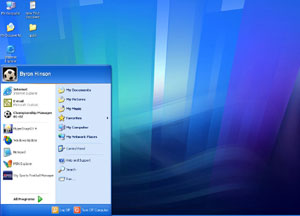
The start menu has been totally rethought and can be rather called a start panel: it is now divided in four distinct parts: on top of the menu there�s a blue bar with the name of the current user and their picture. The left pane shows the most commonly used software below the fixed Internet Explorer and email shortcuts (they can be reassigned to third party software like Netscape or AOL), while the right pane contains shortcuts for the control panel, network connections, printers, windows help, search and run features. Microsoft has also put links to the �My Pictures�, �My Music�, �My Computer�, �My Documents� folder on top of the right part of this new start panel. A �Recent Documents� item is also available and shows a list of the latest documents you�ve worked on for instant access.
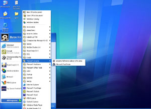
Depending on the settings almost every system and folder link in the start panel can be displayed as menus. It means if I activate the menu view for the �My Music� link of the start panel, Windows will display a menu; listing every file and subfolder contained in the �My Music� place for quick access to my favorite tunes. That way accessing various existing network connections, control panel features, and installed printers are only a mouse click away. Now you may wonder where the various program groups are located? Well at the left bottom corner of the start panel a small �All programs� link lets you display all the program groups that were created by the programs you have installed. Programs can be listed a la Windows 95 or a la Windows 98 if you choose to enable the start menu scrolling feature. New to Windows XP is the fact recently installed programs are highlighted to better spot them. Finally the bottom blue part of the start panel contains two buttons to close the current session or close the computer.
Microsoft
Windows XP New Start Menu (click to enlarge)
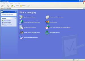
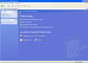
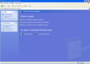
Windows XP comes with a brand new control panel applet. Well in fact Microsoft did to Windows XP the same thing they already did to Windows Me: the control panel is now divided in nine categories you have to pick up, to do what you want to. This radical change has been made to make sure novice users aren�t confused by too numerous options. Obviously power users can switch into the classic view mode. The appearance of the Control panel has been also changed to match the new Windows XP look.
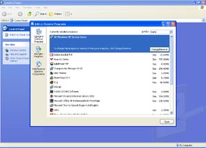
Microsoft
Windows XP Control Panel (click to enlarge)
Now that we have seen what�s new in the start menu & taskbar let�s have a look at the desktop. Windows XP�s desktop now sports 32 bit color icons that feature an �aqua� style. Sure it�s still possible to configure the desktop to be displayed in 16 bit color but icons aren�t as beautiful as they should be. Unlike previous versions of Windows, the wallpaper isn�t degraded by icons� labels since Microsoft has made them transparent! Icons are Alpha-blended so they have smooth edges with a slightly shade effect. Windows XP also comes with an impressive list of cute desktop wallpapers to adapt the desktop to your mood.
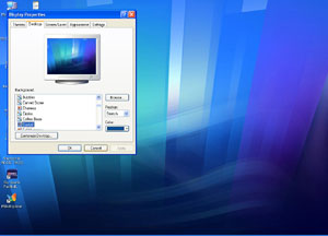
Microsoft
Windows XP Wallpapers list (click to enlarge)
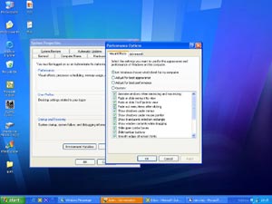
Microsoft
Windows XP Display Performance (click to enlarge)
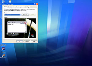
Windows XP is supposed to be the first Microsoft operating system to be skin-able. Only two skins are bundled with the system:the well known Luna default skin and the Windows classic one. Initially Windows XP Home and Professional editions were expected to feature two different skins, (along with the classic one) but Microsoft has given up providing one common skin for both OS. Switching to the classic skin will restore a Windows 2000 like interface but frankly itis not as interesting. Windows XP does include all the native APIs to skin the operating system, however due to time constraints Microsoft didn�t include supplementary skins. Maybe some Microsoft skins will be available later on Windows Update but it�s a fact WindowsBlinds will let you skin the OS at your convenience.
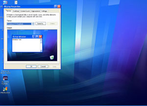
Microsoft
Windows XP Themes Dialog Box (click to enlarge)
The colors of the so called �luna� skin can be changed letting you add your own touch for a bit of variation. There are only three color themes actually available: the blue, the silver and the olive green one. The olive one is a pure horror, while the silver and blue color themes are nice: selecting one of these color themes will change the colors of the taskbar, start menu and the windows title bar and borders. Rumors state that Microsoft has copper, ruby, emerald, and night color schemes in its drawers but it�s unsure whether these exciting new schemes will be released or not.
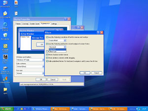
Another new feature introduced by the revamped Windows GUI is the inclusion of the ClearType technology. ClearType has been developed by the Microsoft Research Center to provide the best on-screen readability on multiple platforms. Indeed ClearType allows for improved display clarity by 300 percent on standard LCD screens since the horizontal resolution is tripled in rendering text. Primarily dedicated to enhance the viewing experience on laptops, the ClearType feature also manages to boost on-screen quality on conventional monitors.
ClearType
Technology (click to enlarge)
Windows XP�s interface changes are so deep they affect most existing programs. Windows� title bars are now blue like minimize, maximize, and resize buttons while the close button is red. The most common Windows controls have been revamped so windows now displays rounded silver buttons that are circled by a light blue frame, checkboxes display green marks, progression gauges are now green, scrolling bars feature a blue aqua look, toolbars are flat, menus have a white background and display shade effects on their extremities. Most programs have to be rewritten so you can enjoy the new Windows XP controls. Just like in Windows 2000, the mouse cursor shows a small shading effect.


