 |

|
| ActiveWin | Active Network | New Reviews | Old Reviews | Interviews |Mailing List | Forums |
|
|
|
|
|
DirectX |
|
ActiveMac |
|
Downloads |
|
Forums |
|
Interviews |
|
News |
|
MS Games & Hardware |
|
Reviews |
|
Support Center |
|
Windows 2000 |
|
Windows Me |
|
Windows Server 2003 |
|
Windows Vista |
|
Windows XP |
|
|
|
|
|
|
|
News Centers |
|
Windows/Microsoft |
|
DVD |
|
Apple/Mac |
|
Xbox |
|
News Search |
|
|
|
|
|
|
|
ActiveXBox |
|
Xbox News |
|
Box Shots |
|
Inside The Xbox |
|
Released Titles |
|
Announced Titles |
|
Screenshots/Videos |
|
History Of The Xbox |
|
Links |
|
Forum |
|
FAQ |
|
|
|
|
|
|
|
Windows XP |
|
Introduction |
|
System Requirements |
|
Home Features |
|
Pro Features |
|
Upgrade Checklists |
|
History |
|
FAQ |
|
Links |
|
TopTechTips |
|
|
|
|
|
|
|
FAQ's |
|
Windows Vista |
|
Windows 98/98 SE |
|
Windows 2000 |
|
Windows Me |
|
Windows Server 2002 |
|
Windows "Whistler" XP |
|
Windows CE |
|
Internet Explorer 6 |
|
Internet Explorer 5 |
|
Xbox |
|
Xbox 360 |
|
DirectX |
|
DVD's |
|
|
|
|
|
|
|
TopTechTips |
|
Registry Tips |
|
Windows 95/98 |
|
Windows 2000 |
|
Internet Explorer 5 |
|
Program Tips |
|
Easter Eggs |
|
Hardware |
|
DVD |
|
|
|
|
|
|
|
ActiveDVD |
|
DVD News |
|
DVD Forum |
|
Glossary |
|
Tips |
|
Articles |
|
Reviews |
|
News Archive |
|
Links |
|
Drivers |
|
|
|
|
|
|
|
Latest Reviews |
|
Xbox/Games |
|
Fallout 3 |
|
|
|
Applications |
|
Windows Server 2008 R2 |
|
Windows 7 |
|
|
|
Hardware |
|
iPod Touch 32GB |
|
|
|
|
|
|
|
Latest Interviews |
|
Steve Ballmer |
|
Jim Allchin |
|
|
|
|
|
|
|
Site News/Info |
|
About This Site |
|
Affiliates |
|
Contact Us |
|
Default Home Page |
|
Link To Us |
|
Links |
|
News Archive |
|
Site Search |
|
Awards |
|
|
|
|
|
|
|
Credits |

|
|
Product: Publisher 2003 Company: Microsoft Website: http://www.microsoft.com/office Estimated Street Price: $169, $99 Upgrade Review By: Brian Kvalheim |
Features
| Table Of Contents |
| 1:
Introduction 2: Features 3: Advanced Features 4: Conclusion |
Microsoft Office Publisher 2003 carries on the tradition of sharing the user interface. In fact, the Publisher team has carried over many of the Word modals such as the paragraph and widow orphans for a more consistent Office look and feel. Office System 2003 also added a new adaptive "skin" to all of their new applications. What this means to you is that the Office interface will share the same skin color that your Windows XP system is wearing. In this particular review you will note that I am using Windows XP in Classic Theme, which is the color that Publisher 2003 is showing. Many users have found that using the default Windows XP Theme (blue) might be a bit overwhelming in color.
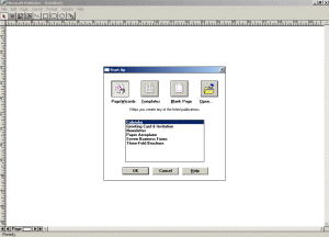
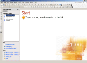
Microsoft Publisher 1.0 vs.
Microsoft Office Publisher 2003 GUI (click to enlarge)
For 2003, the Task Pane has improved in functionality and features. As before, the Task Pane can be moved to either the left or right side of your work space (or floating). However, 2003 added the following panes: Help, Research, Find and Replace, Graphics Manager, Design Checker, Apply Master Page and Background. The reason for the implementation and extended use of the Task Pane was to eliminate the dialog/modal box that would cover your publication when using these features. The Task Pane puts these features on the side, out of the way of your work in progress. The Publisher team fully understands the need for as much real estate as possible when working. Many of the newly added Task Pane features are either new features, or newly enhanced features. The Task Pane can be closed, however it is required for many of your daily tasks.
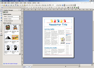
Microsoft Office Publisher
2003 Graphics Manager Task Pane (click to enlarge)
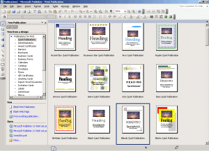
Microsoft learns more than we could possibly know through usability testing. In the case with Publisher, the Publisher team found that the user was overwhelmed by the startup page of Publisher. With what appeared to be clutter to some, normally would scare the user into thinking that they were limited to what was offered in the main window. For 2003, the start up screen was cleaned up, offering the users to browse the Task Pane for their preferred publication type. The same research concluded that the templates get reorganized into sections for Print, Web Design, Design Sets and Personalized Templates. The great thing about the new Personalized Template section is that the user can add their own subsections by accessing the properties of their Publisher files and naming the catagories. Once you apply a property name to the category and save your publication as a template, your subsections will appear under the My Templates section of the Task Pane at startup.
Microsoft Office Publisher 2003 Start Up Screen (click to enlarge)
In our review of Publisher 2002, we covered the Design Gallery in detail. Without needing to rehash, I wanted to point out that again, Microsoft has updated the interface to match the new packaging and Gui to this modal. However, I believe they once again have dropped the ball in respect to taking advantage of what could be a very powerful feature. In its current form, the gallery can only be used for existing publications. Any graphic that is added to this gallery will only be retained for the publication you are working in. In addition, it's sloppy. The demand shows that users want to add their objects and graphics to the gallery and then be able to use these in future blank publications. In addition, this feature would benefit from allowing users to drag and drop objects into their own personalized area. These objects would included (but not limited to) items from the web, current publisher publication and other compatible Office objects.
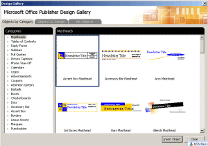
Microsoft Office Publisher
2003 Design Gallery (click to enlarge)
Microsoft Office Publisher 2003 shares the Research Task Pane (great XML implemenation) with other Office 2003 applications. Without going into too much detail (as this has been covered in other Office reviews), this Task Pane adds Translation, Dictionary, Thesaurus, Web Search and Stock Quote retrieval opportunities in what I consider to be the bastard child of Office. Retrieve your latest stock quotes and with a click of a button, have them carry throughout a table. Translate from English to French over the web. And even search for an article in the Encarta MSN Encyclopedia and import it into your school paper. These features can be used in conjuction with Font Schemes and Color Schemes, with full formatting support. Some competing applications don't allow for spell checking or formatting these inserted text links, where as Publisher fully supports spell check and autocorrections.
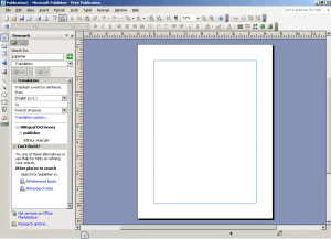
Microsoft Office Publisher
2003 Research Task Panes (click to enlarge)
Microsoft Office Publisher 2003 supports a highly requested zoom power along with Magellan mouse support. Microsoft Publisher 2002 left off with a maximum 400% zoom, where as version 11 now doubles that at 800%. While I am still not satisfied with the maximum zoom (move into print preview mode and you are given 1000%), it's a step in the right direction. Publisher 12 should see a 1600% zoom for full pixel manipulation and arranging of graphics for print and web. Magellan support adds 4 button zoom and panning with the proper mouse.
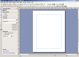
The Find and Replace feature has seen a bump of improvement due to customer feedback. In previous versions of Publisher, Find and Replace was limited to the current selected text box story. For 2003, Microsoft added the ability to Find and Replace across the entire publication, over multiple pages. Keep in mind this feature is limited to text only. I have submitted a wish for a Find and Replace object and graphic Task Pane for Publisher 12.
Microsoft Office Publisher 2003 Find & Replace Task Pane (click to enlarge)
Miscellaneous Features
Microsoft needed to spend a little time fixing features that they removed or broke in the past version of Microsoft Publisher. I am happy to say that they have chosen to fix some of the more annoying ones in Office Publisher 2003. What may seem trivial to some was detrimental to others. Bad enough that they chose not to use the newer version. Publisher 2002 introduced *hashed* text borders. These borders were implemented as a shared feature from the Escher team which mimicked the PowerPoint 2000 Text Boxes in the Drawing feature set. The Publisher team believed it would be easier to select and size a text box with this "thicker" border. The outcry was heard across the world. No longer could users properly line up, arrange and distribute their text boxes. Overlapping and offset text boxes made for difficult and painstaking proofing, many times requiring a wasted printout to determine whether or not the boxes were properly aligned. Publisher 2003 disposed of these "hash" marks and went with the traditional thin line borders. Amen.
2002 was the year that Microsoft decided that the user no longer had a need to insert a blank picture frame into their publication. Users loved the ability to create and design a newsletter with picture frames in place when the actual pictures were not yet available for them to import. 2002 required the user to either import a blank picture, a different picture, or insert an auto shape in place of the picture, thus requiring the user to remove said auto shape once they received the picture. Once again adding time and steps and breaking a long standing tradition of listening to the users. Publisher 2003 has of course addressed this.
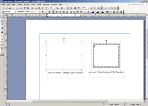
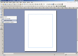
Microsoft Office Publisher
2003 Text Box Comparison and Insert Blank Picture (click to enlarge)
Another hidden, but much requested feature added to Office Publisher 2003 are baseline guides. These are guides to which lines of text can be aligned to provide a uniform appearance between columns of text, to precisely align text lines across multiple columns. With baselines activated, this adds the ability to use the snap to features for ease of alignment.
Still not perfect (and probably never will be), Publisher 2003 seems to have addressed many issues. One issue that I would like to have seen addressed would be the ability to export your file in *.pdf format for commercial printers. Secondly, the print dialog/page setup dialog is still horrible. While 2002 combined these dialog boxes into one dialog, the most important features were left out, some of which printer drivers have no control over. Try printing select pages, such as page 1, 3, 7, 14. Not going to happen. Try printing odd or even pages. Not going to happen, at least not without knowing how to program using VBA and creating an add-in. Publisher is praised for it's label templates and ability to use almost every label size imaginable. However, Publisher will not let you pick and choose where to print a single label on a page of labels. Maybe the Publisher team needs more requests from people like you and I for the ability to choose a row/column to print a label on.


