 |

|
| ActiveDVD | ActiveNetwork | Reviews | News | Forums | Advertise |
|
ActiveDVD |
|
DVD News |
|
DVD Forum |
|
Glossary |
|
Tips |
|
Articles |
|
Reviews |
|
News Archive |
|
Links |
|
Easter Eggs |
|
Drivers |
|
Amazon.com 100 Hot DVDs |
|
|
|
|
|
|
|
News Centers |
|
Windows/Microsoft |
|
DVD |
|
Gaming |
|
ActiveHardware |
|
Xbox |
|
News Search |
|
|
|
|
|
|
|
ANet Chats! |
|
The Lobby |
|
Special Events Room |
|
Developer's Lounge |
|
XBox Chat |
|
|
|
|
|
|
|
ActiveWin |
|
Articles |
|
AskAW |
|
DirectX |
|
ActiveDVD |
|
ActiveGaming |
|
Forums |
|
Interviews |
|
News |
|
MS Games & Hardware |
|
Reviews |
|
Support Center |
|
Windows 2000 |
|
Windows Me |
|
Windows XP |
|
|
|
|
|
|
|
Windows 2000 |
|
Available Systems |
|
Benefits |
|
Bugs & Fixes |
|
FAQ |
|
Drivers |
|
History |
|
Introduction |
|
Links |
|
Upgrade Issues |
|
Utilities |
|
Patches |
|
|
|
|
|
|
|
FAQ's |
|
Windows 98/98 SE |
|
Windows 2000 |
|
Windows Me |
|
Windows "Whistler" XP |
|
Windows CE |
|
Internet Explorer 6 |
|
Internet Explorer 5 |
|
Xbox |
|
DirectX |
|
DVD's |
|
|
|
|
|
|
|
Tips & Tricks |
|
Registry Tips |
|
Windows 95/98 |
|
Windows 2000 |
|
Internet Explorer 4 |
|
Internet Explorer 5 |
|
Windows NT Tips |
|
Program Tips |
|
Easter Eggs |
|
Hardware |
|
DVD |
|
|
|
|
|
|
|
ActiveXBox |
|
Xbox News |
|
Box Shots |
|
Inside The Xbox |
|
Released Titles |
|
Announced Titles |
|
Screenshots/Videos |
|
History Of The Xbox |
|
Press Releases |
|
Links |
|
Forum |
|
FAQ |
|
|
|
|
|
|
|
Latest Reviews |
|
Games |
|
Max Payne |
|
Microsoft Train Simulator |
|
|
|
Applications |
|
Microsoft Windows XP Professional |
|
Norton SystemWorks 2002 |
|
|
|
Hardware |
|
Intel Personal Audio Player 3000 |
|
Microsoft Wireless IntelliMouse Explorer |
|
|
|
|
|
|
|
Site News/Info |
|
About This Site |
|
Affiliates |
|
ANet Forums |
|
Contact Us |
|
Default Home Page |
|
Link To Us |
|
Links |
|
Member Pages |
|
Site Search |
|
Awards |
|
|
|
|
|
|
|
Credits |

A Look At Aspect Ratio's
The aim of this article is to help you understand the different viewing options available today. Terms such as 'Pan & Scan', 'Letterbox', and 'Anamorphically Enhanced' are commonly used in the DVD world. These terms have been around for years, but for the average person these terms have little or no meaning. Often they can be confusing. If you'd like a little insight into 'Aspect Ratios' read on.........
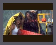
Okay, where do we start...... When you go to the movies you are, more often than not, watching a film that has been filmed in Panavision 'Scope'. Basically this means the movie has been filmed with a very wide lens and produced in an image with an aspect ratio of 2.35:1. That means the image is 2.35 times wider than it is high. See the example is shown by figure 1 below.
| figure 1. |
|
|
Image � 1996 Warner Brothers. |
|
| This image was taken from "Twister." It is indicative of what you would see in the cinema. |
This looks great when we are at the cinema but what happens when you watch it in your own lounge room? Unless you're a millionaire, or good friends with one, you can't have a movie cinema at home. So how do you see it at home?
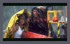
The majority of televisions around the world are practically square in shape. It is sometimes referred to as 4x3 (aspect ratio of 1.33:1) . But we all know you can't fit a rectangle into a square. Or can you? In order to overcome this problem the 'Letterbox' format was developed. This means that they shrink the entire image until it's small enough to fit inside the 4x3 square television screen. Thus you get the entire image as it was filmed and as the director intended on your television. An example of what this looks like is shown below in figure 2.
| figure 2. |
|
|
Image � 1996 Warner Brothers. |
|
| The same image as shown above in figure 1, but this time 'Letterbox' onto a normal television. |
Now for the avid Home Theatre buff this was great! They got get to see the version as it was originally filmed and shown in the cinema. But for the average home consumer who loves to watch their movies on a Saturday night this did not go over well. They complained they didn't like the black bars, or the picture was too small. Some people thought that the actual image had been cropped and the black bars were actually blacking out the rest of the picture. For these reasons, along with a few others 'Letterbox' movies took a back seat. So what happened next? In order to satisfy the general public who wanted all of the viewing area filled the format 'Pan & Scan' was developed.
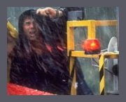
The original film is then 'cropped', or cut, blown up to fill the screen the entire screen. This resulted in up to 40-50% of the original image being discarded. See illustrate this point take a look at the difference in the two examples below.
|
'Pan & Scan' |
|
| figure 3a. |
|
|
Image � 1996 Warner Brothers. |
|
|
'Letterbox' |
|
| figure 3b. |
 |
|
Image � 1996 Warner Brothers. |
The vast majority of consumers were satisfied with this, but not the discerning Home Theatre enthusiast. Watching a film that had been 'cropped' was simply not an acceptable option. So 'Pan & Scanned' versions were left for the VHS rental market, the VHS home video collector, and for television broadcasts. The 'letterbox' format became more commonly only used for Laserdisc and DVD owners, although it is starting to make a comeback in "Special Edition" VHS tapes.
With the advent of 'Widescreen' televisions in the market place the 'letterbox' image was improved on again. The widescreen, or 16x9, has the aspect ratio of (1.78:1). As you may have noticed that is not as big as the theatre format of 2.35:1. The black 'letterbox' bars were there, but this time much smaller. In order to reduce the width of the black bars a format called 'Anamorphically Enhanced' was developed. This means the image is able to be 'vertically stretched' . With 'anamorphic widescreen' the picture is stretched in the horizontal plane ONLY! If the original aspect ration is 1.78:1 anamorphic then it will, after horizontal expansion, fill up the whole screen (top to bottom, left to right). However, if the original aspect ratio is 1.85:1, or 2.35:1 anamorphic there will still be black bars above and below the horizontally stretched image. 'Anamorphically Enhanced' produces better pictures on widescreen TV's because more information is recorded in the vertical plane (more lines). 'Letterbox' has fewer lines recorded in the vertical plane. Basically, a letterbox image is not as tall as an anamorphic image prior to stretching by widescreen TV.
Figure 4 below illustrates the differences between 'Anamorphically Enhanced' images and 'Letterbox' images. Compare figure 4a and 4b. Notice how much smaller the black bars are in figure 4a.
| An 'anamorphically enhanced' image on widescreen television. | |
| figure 4a. |
|
|
Image � 1996 Warner Brothers. |
|
|
A 'letterbox' image on regular 4x3 television. |
|
| figure 4b. |
|
|
Image � 1996 Warner Brothers. |
As you can see, the "Anamorphically Enhanced" image looks great. With the added resolution and the smaller black bars it makes for ideal home viewing.
** Note: The above images have been modified from their original state. They DO NOT represent actual images of this movie. They are being used only for demonstration purposes to help illustrate the points made in this article.**
This article was created by DVDown Under. � Copyright Paul James, 1998. Used with permission. Edited by ActiveDVD, 1999. This article in its original format, "Letterbox - vs. - Pan & Scan", can be found at http://www.fan.net.au/~jamesy/Letterbox-vs-Pan&Scan.htm.
Copyright � 1997-2001 Active Network, Inc. All Rights Reserved. Terms of Use. Privacy Policy.
Forum Software Copyright � 2000-2001 William D. Sossamon. Layout by
Byron Hinson. Content written by the Active Network team.


